“A colour scale determines our world as much as political choices”
INTERVIEW WITH ARTIST GÁBOR KRISTÓF
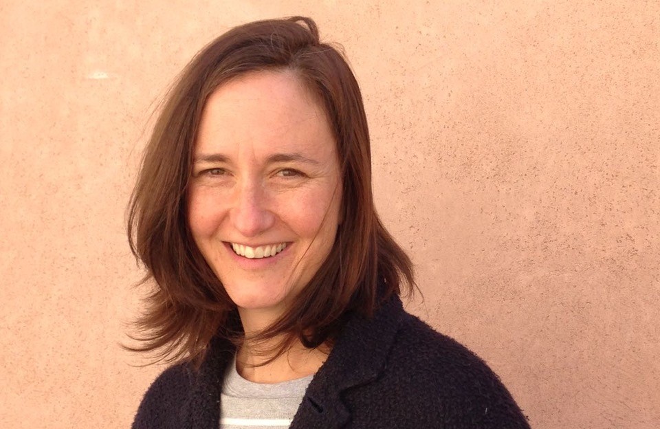
Gábor Kristóf (1988) was born in Kassa/Košice and is currently based in Budapest. In addition to his regular shows in the region, his work will soon be on display in Berlin. His body of work is characterised by two singular and, at first glance, perhaps contradictory characteristics: strong formal shifts occur alongside a programme-driven approach. He typically creates series, which upon close inspection reveal references to both earlier and later works. While there is continuity in Kristóf’s use of concepts and materials, the form these take is highly variable, ranging from paintings and installations to found objects, photographs, and texts.
The works explore systems that share many similarities despite seeming initially distant from each other.
Three series are mentioned in the following interview. Before jumping straight in, let’s say a few words about each of them.
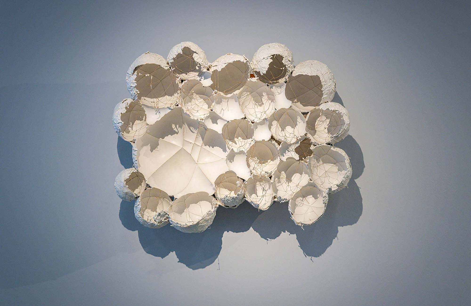
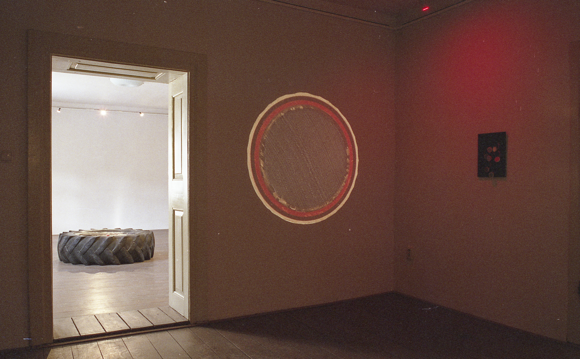
In showcasing used offset printing sleeves, Heidi’s abstracts presents the traces left by industrially-printed texts and images. The series has been presented in several venues in Budapest, including Trafó Gallery (2016), AQB Project Space (2021), and Kincsem Palace (2020). The collection is continuously expanded through travels abroad and has also been shown internationally, for example in Paris at the Cité Internationale des Arts residency (2016), at Art in General in New York (2017), and in Slovakia, most recently with the Picnic on the Driving Range exhibition in Selmecbánya/Banská Štiavnica (2021).
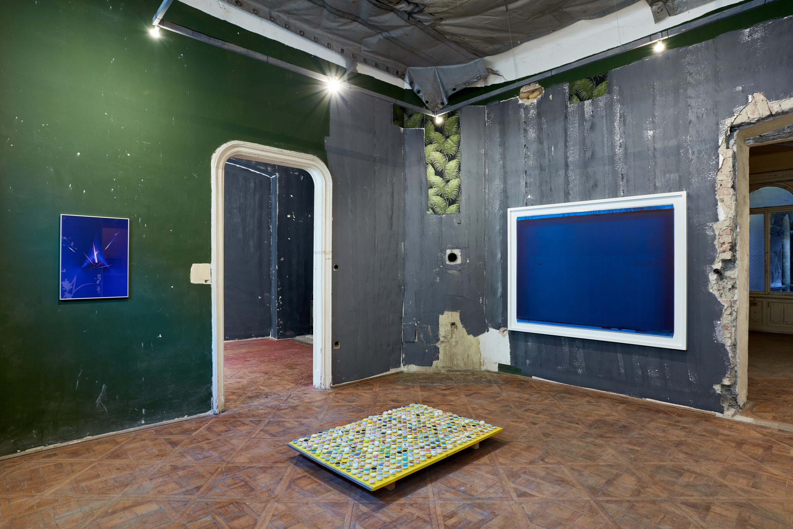
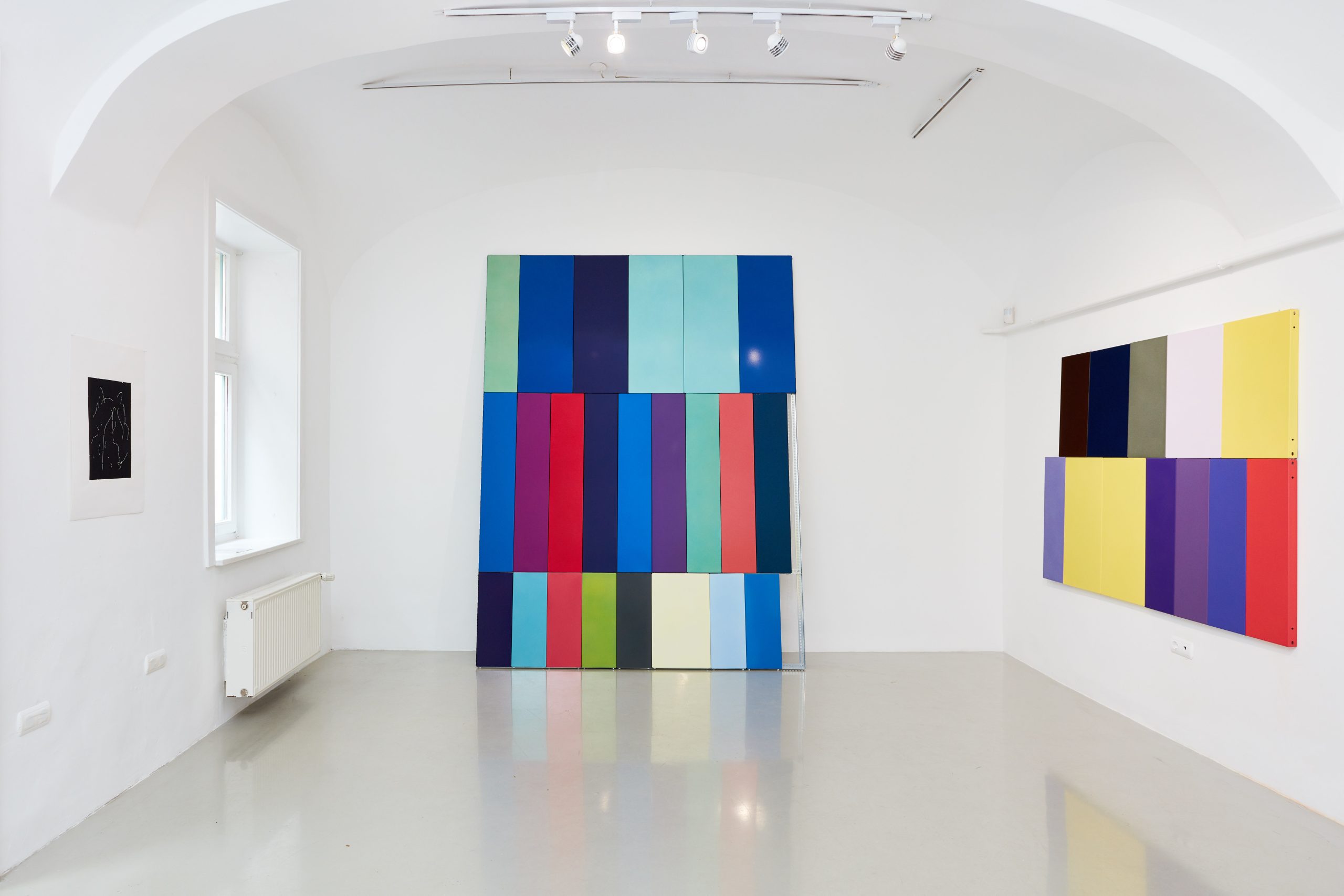
In industrial manufacturing, coloured metal elements are produced through a process of sintering. This colour palette surrounds us in the form of buildings, institutions, public transport and (non-) places — in other words, buildings and objects from the industrial environment. Gábor Kristóf’s works which explore the questions raised by the palette have been shown, for example, in the industrial Czech city of Zlín (where — among other shoe factories — the famous Baťa factory was founded in 1894), in Dust On a Shelf (2019) at Galerie Kabinet T., Melting Point (2016) at Horizont Gallery in Budapest, and Open Due to Vacation (2019) at Kisterem Open, Budapest.
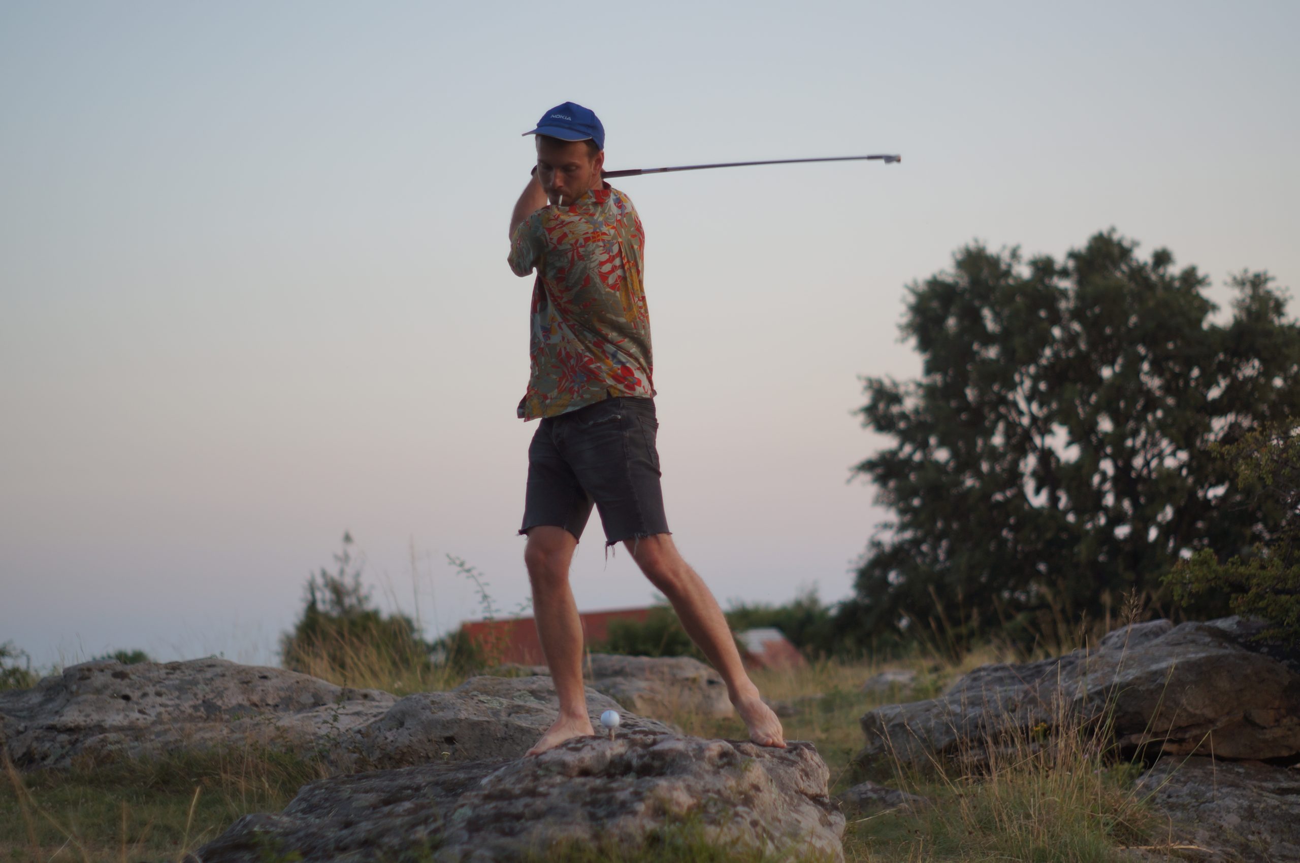
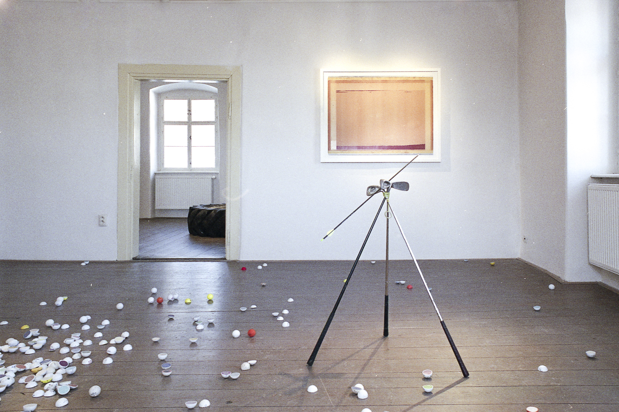
His latest series explores, deconstructs, abstracts, and occasionally parodies the closed world of golf, with all its symbols and rules. The works created thus far have been exhibited twice already: Picnic on The Driving Range (2021) at the Schemnitz Gallery in Selmecbánya/Banská Štiavnica, and Untitleist at Kisterem (2023). A sequel featuring new works will be shown at Wannsee Contemporary in Berlin in June.
The studio where we meet consists of three rooms, including a small storage space and office area, a work table and a sintering machine. It feels more like a professional workshop than a traditional art studio.
During my work around the industry-standard colour palette, the somewhat idealistic thought of proposing a new colour to the RAL Institute really took hold of me. RAL is one of the ‘bodies’ with the most control over the basic colour palette; proposing a new colour basically means an expansion of the colour range itself. A dialogue regarding this has been initiated, but with no concrete results yet. For me — as an artist working with colour — this would be truly cathartic: it would be the kind of social feedback that I have always envisioned and longed for.
Since December, we have been renting (with architect Ivett Pásztor – ed.) a workshop/studio here at AQB (Art Quarter Budapest), in part with the goal of realising a six- or seven-year vision. The idea is to somehow open up the knowledge that we have accumulated throughout the years about sintering and colours in general, and try to channel it back into practical use.
After I come back from the exhibition in Berlin, I might do some professional paint jobs for a while instead of doing art.
I’m really interested in moving into the field of applied arts.
Your use of materials is characterised by a ‘layered’ continuity: new series often pick up materials and techniques used in previous ones, despite the fact that you are working on different subjects. You are also very versatile when it comes to form; you have used everything from the environment and painting to ready-mades.
Yes, stylistically the series are very, very different. But what holds them together in my eyes is the more conscious way of working that I have adopted since Heidi’s abstracts — and which is all about exploring what’s beyond industrial standardisation. For years, I’ve been moved by the very fact of these printing presses, tooling or even powder coating industries, sintering companies and the like: all of these mechanised, standardised systems that fundamentally define our visual environment. As technology has developed, decisions have been made that no one has ever explained. I am attempting to return to the moments at which these decisions were taken and ask what would’ve happened if these decisions had not been made. My curiosity has always been drawn to smaller models that exist within larger systems; these are often closed systems, where a very strange, abstract machinery is at work
and a lot of decisions are made that are then completely absorbed into our everyday lives.
That’s how I see golf, by the way. This refers specifically to the fact that a colour scale determines our world as much as political and economic decisions — which, by the way, are often made on golf courses! My working method is based on a process of searching; once I’ve found something, the form emerges organically.
Can you retrace this process within a specific series? For example, in the case of the colour palette works, how did the image of assembled metal shelves come about?
It’s hard to didactically explain why it turned out the way it did — in a way, I get these shapes ready-made. The colour palette as such can’t be dissociated from the fact that it is used to paint industrially produced metal pieces. The works that dealt with this them were really trying to play with the fact that this is an industrial system where, if you make a mistake (but are these really mistakes?), quality control will simply not let it slip. Each of these works contained a small sign indicating that something had gone wrong in terms of industry standards. As such, they end up in a vacuum of sorts: because they haven’t passed quality control, they don’t go into distribution — but destroying them is much more expensive than simply putting them aside. I thought this made for a nice parallel with art.
How typical is it for you to be selective during your work process? Are there alternatives that are eventually left out?
It’s interesting to note that while I want to criticise this very apparatus, I also end up playing the same game; for example, in the case of Heidi’s abstracts, I didn’t take all the offset sleeves from the printer and simply present them as I had found them. There were simply too many and I had to sort — that’s when a second selection occured. It’s the same in my project dealing with the standard colour palette; from the moment I start to break up or expand the standard, I’m also making choices — in other words, I’m doing on a small scale what’s happening on a large one.
In this sense, the snake keeps biting its own tail and there’s simply no way out of this trap. I think that’s why I’m always looking for different materials and different series: somewhere, there must be a more perfect one. That’s why I can’t stay too long with a given series — sooner or later, the loop closes.
Although there are some mechanical parallels, the driving force, the context and the result of your artistic practice are completely different from ones in the industry at large. If you work from your environment, from everyday visual or material culture, isn’t this kind of selection inevitable?
Yes. Nevertheless, I am an author and as such, I am interested in a technique as long as I believe that I have not yet seen the end of it. As soon as I feel I’m playing the same game as the industry itself, I know I have to move on.
You’ve been working on the topic of golf for a long time — I assume you must have a good grasp of the rules by now. Which rule would you change if you could? Or would you even introduce a new one?
I had to study golf from the moment I started working around it — and I am still constantly learning: I’m getting to know the rules and the language. I would probably change the dress code and introduce some completely absurd rules, such as a minimum of five colours that a player must wear. Of course, golf is fascinating — and fascinates me — precisely because it is,
in theory, about experiencing freedom,
about modelling exactly what it is like to go for a walk outdoors, and yet, these people put themselves into an extremely artificial environment. There are a lot of rules, not only regarding the game itself, but even regarding the dress code itself: there are literally penalties for not dressing appropriately. So grown-up people squeeze themselves into an extremely rule-abiding system which is, moreover very expensive. That’s the absurdity of it.
Was your cynicism about golf so strong from the start or did it develop gradually?
When you could only go out for health walks during the covid closures, we used to go out in the hills around the Kiscelli Museum. That’s how I stumbled upon the Continental Golf Club. There was a stark contrast between the housing estate ‘down below’ in the Bécsi út–Vörösvári út triangle and the terraced golf course above. The Continental is a private club and as such it was not subject to lockdown. It was frustrating that while the infinitely privileged elite were busy playing golf, kids in the housing estate were not allowed to go down to the playground and there were of course no leisure activity options for them either. So I was definitely a bit annoyed from the start. Then I started stalking all the golf courses in the area and began to collect (in other words, steal), the balls that had flown out of their courses.
Obviously this all had some desperate ‘pocket revolutionary’ undertones.
It’s all really fascinating, precisely because of its absurd and very paradoxical nature — and these are the things that move me. The work that goes into the terrain, into the accessories is incredible, but at the same time I’m disgusted by the exploitation of the landscape and the artificial treatment of the whole situation. It’s all very ambiguous.
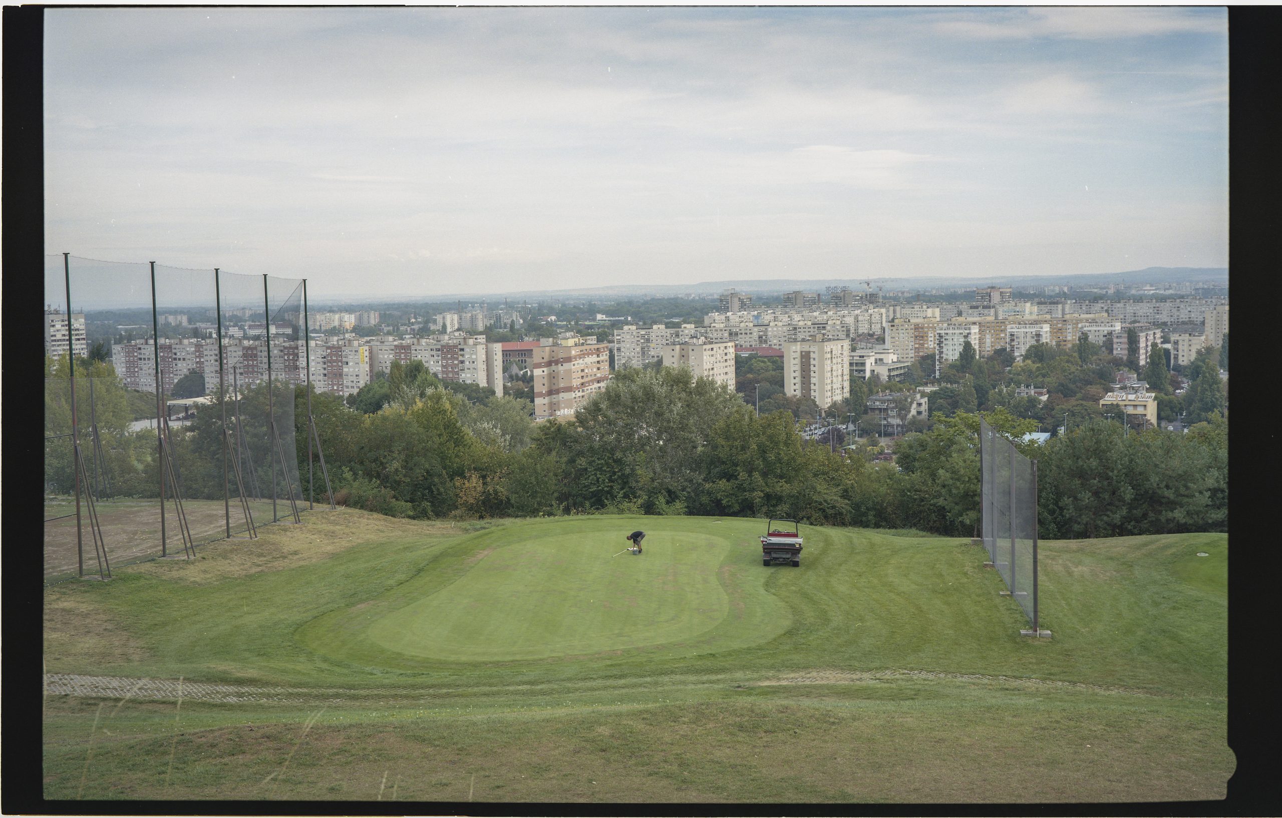
You are dedicating three exhibitions to golf, two of which have already been shown, with one more to come. Apart from the same theme, do they have a specific relationship with each other? Does the exhibition series have a dramaturgy of its own?
The three exhibitions are linked by the somewhat enigmatic, speculative atmosphere that permeates them. In fact, they are fictional interpretations of this odd sport. Just as for most of us, my perspective on golf comes from the outside — so it’s as an outsider that I try to interpret this specific phenomenon. The exhibitions are also framed and linked by texts, written both by myself and by curators.
After I started working with golf, I received an invitation from Slovak curator Vladimír Beskid to visit him in Selmecbánya/Banská Štiavnica at the Schemnitz Gallery. This became the first exhibition in the series, and mainly focused on the artistic landscape surrounding golf. The second, a small-scale exhibition (at Kisterem Gallery, ed.) was inspired by the artistic language of golf, and the exhibition planned for Berlin is based on a very strange site-specific find.
Wannsee — halfway between Berlin and Potsdam — is where Germany’s oldest golf course lays. Before the Wall came down, there was a huge eighteen-hole course and a nine-hole course right next to it. The eighteen holes were used by the Americans, the nine holes by the local Germans. After the wall came down, they were combined to create a very strange, horseshoe-shaped, immensely large golf course with an experimental laboratory in the middle. This structure drew me in: a concentric system, like a fortress or a medieval city. It contains a very protected something in its midst, and the golf course is like its garden. But the golf course is already a very secluded thing to start with. The Berlin exhibition will be about this very special vicinity.
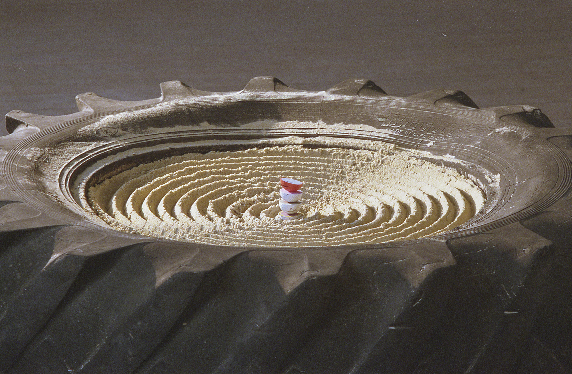
Your use of ‘speculative’ caught my attention. It’s a trendy word nowadays so I thought I’d ask you about it. Why do you think it describes well these specific works?
I sometimes find it difficult to use this word because it is strongly associated with a trend that my work doesn’t follow. But as we were working on the Selmecbánya exhibition, I realised just how much this direction could encompass. I wrote the accompanying texts — they were published in a separate companion publication — and it was very liberating to come up with a framework that was not based on reality. I managed to grapple with this incomprehensible thing through short, fictional diary entries. The point of the accompanying text to Picnic on the Driving Range is an attempt to describe the golf landscape to Pál Szinyei Merse (a famous 19th – early 20th century Hungarian painter – ed.). It was the centenary of Szinyei’s death at the time of the exhibition, and
he painted elites in beautiful poppy fields; that’s pretty much what I saw on the golf courses.
A hundred years might’vepassed but the situation is still very much the same. In these writings addressed to him, I describe how I see the landscape he painted a century later. ‘Speculative’ in this case is a way of thinking that both enables a form of creative freedom and allows for abstract interpretations of a present-day situation. I interpret my need for this as something of a post-covid symptom. The text for Untitleist was written by the curator Piotr Sikora. It could also be considered as fictional, speculative. It’s a coincidence how similar its tone is to my previous publication.
Because of their style full of character, these writings have a considerable impact on the exhibited material — they’re different from ‘sterile’ exhibition guides. Did you use similar textual accompaniments before golf?
I’ve always drawn some kind of interpretive framework around my work, but it had not taken such a form previously; writing such texts is new for me. In previous projects, such as the discarded printed material that make up Heidi’s abstracts, the frame is provided by the fact that I treat them as Heidi’s abstracts. I am attributing them to someone else, either transferring authorship or not taking it up myself. In a way, this gesture performs the same function as the current texts — but through a different medium.
Does this text function as an addition to the works or is it integral to them?
I definitely do not consider it part of the works. The publications are given a place in the exhibition space, but that does not mean that they appear in the exhibition as such. In fact, the text can be treated as something completely autonomous. In the case of Untitleist, Piotr Sikora’s text can be seen as an interpretative attempt that is equivalent to the exhibition’s actual material. I personally like this very much. It gives the role of the curator a different emphasis, perhaps even making them more involved and motivated.
The accompanying texts reveal very clearly your personal relationship to the works’ subject matter — in this specific case, to golf. They are satirical, cynical, opinionated. You don’t appear as yourself in the projects on the industrial colour palette or the Heidi works — but you are quoted in their texts, even when it is written (in one case) by a curator.
I probably enjoy this kind of framing at the moment because, on an aesthetic level, I work with a lot of elements that can be easily pigeonholed into certain categories. This can lead to/create a form of mis-categorisation, even while I try to resist the categorisation of my works as such. This is why it is important to have a text in which I can take a stand, express where I am speaking from, what my position is.
Does this mean that you have already felt at times that your works were ‘put on the wrong shelf’?
Definitely. The best example is Heidi’s abstracts. This series has for the most part been categorised as abstract, minimalist or geometric painting. Before that, I wasn’t really interested in these trends — and that’s not what’s interesting about Heidi’s abstracts either. What interests me is that I found an object that reproduces this aesthetic not as a self-referential painting, but as something that has a causal relationship with society. What is sent to the press? What is it considered important enough to be printed in so many copies? The abstracts are both the antithesis and the consequence of this. A strange automatic abstraction within the system. If there were no printing presses, no newspapers, no books, there would be no Heidi’s abstracts either. And vice versa.
It is an abstraction that cannot be accused of being invalid or self-serving,
because it is born of itself as a ‘by-product’. I would go even as far as to say it is a perfect abstraction embedded in a form of social authorship. I can admit that aesthetically they can be classified within one of the classical painting movements, but here the form isn’t the point. A purely formal reading of these works makes for a superficial interpretation.
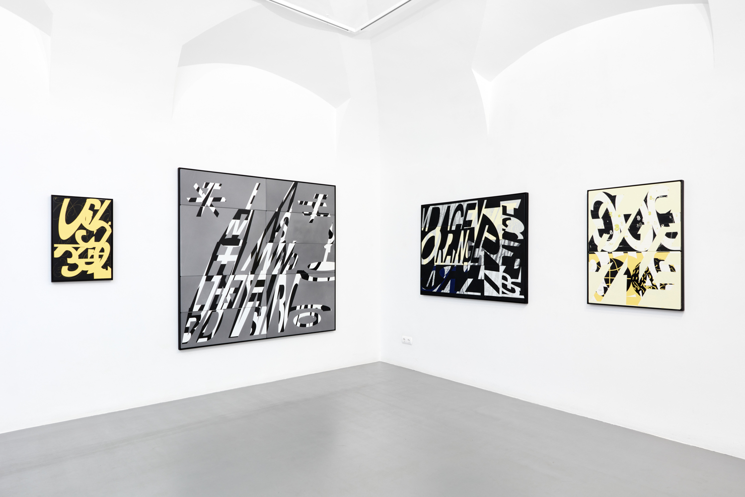
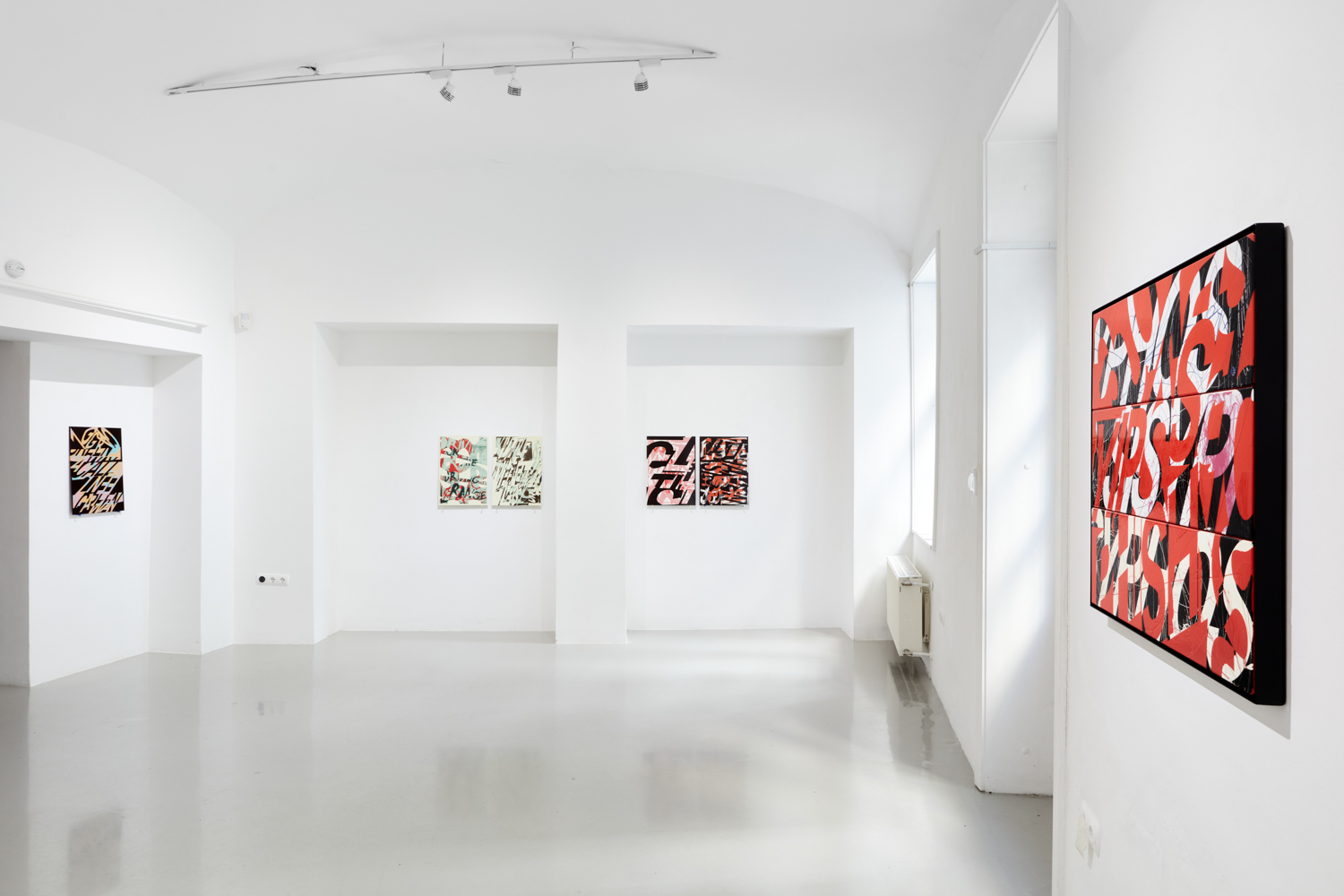
One can feel that there is a mature and thorough background to Untitleist, which is otherwise quite simple in its format: pictures on the wall. However, upon entering, one’s first visual impression brings to mind street art. Correct me if I’m wrong — but I wouldn’t think this aesthetic is embedded in the concept itself, that it is consciously present in the works. Is this closeness to graffiti imagery merely a coincidence?
You’ve hit on a problematic issue. I was totally unaware of this, I was pretty much ready with the material for the exhibition when a friend visited me and said the same thing. That when it dropped. Obviously, since then I’ve been thinking a lot about this material’s position in regards to graffiti. Since it’s not something I had envisaged from the start, it’s not built into the work itself. I’ll do my best not to be give any post-fact explanation, but I don’t feel that the world of golf is totally alien from graffiti. By now, the rules and forms of street art have also become congealed, which contradicts the genre’s initial freedom. Groups of people follow a goal and a set of rules. You’re trying to get your own alias everywhere, in a clearly legible manner. Being visible and legible in the underground is as absurd a goal as hitting a ball through eighteen holes.
In my pictures these texts always want to hide, to be destroyed, to be transformed. They don’t reveal any tangible brand names or slogans, because perhaps that’s precisely what I hate, what I’m suspicious of.
Based on the large printing presses and the RAL colour scale, it would seem that you are attracted to the world of industry and industrial techniques. This also bears a relationship to golf, which is also hermetic and cold. Have you ever wondered where your interest in this might have come from?
My parents moved to Košice/Kassa from the countryside. They studied mechanical engineering in the 80s and were probably motivated by a career in this domain. Of the two, only my father worked in this profession, and only for a few years at that. The regime change completely rewrote perspectives, and probably aspirations and opportunities too. This is also very salient point for me; how does the fate of a huge industry with a rock-solid vision become vulnerable to political events.
The other aspect that draws me to industrial processes is that even though we spend most of our time in virtual spaces, we remain bound to an actual physical space — one that is still dominated by the standards, supply and technology of industry. And by golfers too, haha.
Translated by Áron Rossman-Kiss

